Prosper branding
Here you can find the basics of the Prosper branding, together with links to high-res artwork and branded materials for you to repurpose.
a. Logos
There are three variants of the Prosper logo – suited to different formats and contexts:
The hi-res and .ai artwork for all these can be downloaded here.
Logo with strapline:

Logo without strapline:

Circular logo (ideal for things where the logo needs to be less prominent, or for usage such as social media profile pictures):

b. Fonts
We use two fonts for all of our collateral and materials:
The official Prosper font – for use in our designed-up materials and in our logo – is the LL Circular family, specifically LL Circular Bold for headings and subheadings, and LL Circular Book for main body text.
However, this is a paid-for font, and we appreciate not everyone has it on their system. Therefore, for the bulk of our communications – we use the similarly-styled Arial font (Bold and Regular).
Both these fonts are clear and simple, in keeping with our commitment to accessibility.
In both cases we typically (on word documents and similar) use 16px for headers/subheadings, and 12px for main body text. However, in the modern multiple-format and web-heavy world, appropriate sizes are often dictated by the format – we generally aim for what looks clear and sensible in the context at hand.
c. Prosper portal QR code

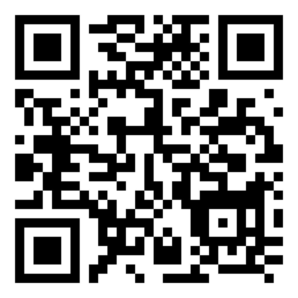
This is our QR code for the Portal. While you’re free to use your own, using this one allows us to track (anonymously!) hit rates.
Download the code here.
d. Iconography
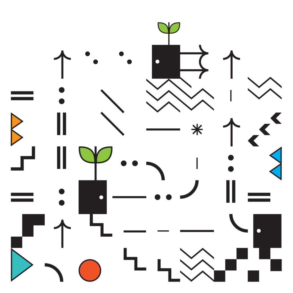
At the heart of the Prosper brand are a set of abstract icon tiles that can be combined as you wish.
We use 84 tiles in total, and these can be downloaded as .ai files here.
However, it is likely more convenient for you to use some of the tile sets we’ve already created and used ourselves, such as the one shown here. You can download the full set here.

As well as our abstract icon tiles, we also have three icons that carry specific meaning – they represent our Reflect, Explore and Act resources respectively:
The colours of these icons are fixed (see section on colour).
e. Colours
With the exception of our iconography, Prosper’s main brand colours are monochrome and greyscale. More precisely, the following shades:
| Primary colour | Primary colour | Supporting colour | Supporting colour | Supporting colour | |
| Name | Black | White | Dark grey | Mid grey | Light grey |
| RGB | 0/0/0 | 250/250/250 | 89/89/90 | 163/168/170 | 228/232/229 |
| Hex | #000000 | #FFFFFF | #59595a | #a3a8aa | #e4e8e5 |
We also have three specific coloured shades that we use to theme our Reflect, Explore and Act sections/resources, respectively. The Reflect, Explore and Act icons should always be in the correct shade, and the shade can be used to theme resources more broadly.
Additionally, in the same vein, we have distinct thematic shades for our Managers of Researchers and Institutions sections/resources.
We also use pastel versions of each where appropriate. The RGB and Hex values for all of these are:
| Reflect | Explore | Act | ||||
| Name | Reflect blue | Reflect background | Explore teal | Explore background | Act purple | Act background |
| RGB | 38/104/173 | 222/232/243 | 59/166/166 | 225/242/242 | 131/81/160 | 242/237/245 |
| Hex | #2668AD | #DEE8F3 | #3BA6A6 | #E1F2F2 | #8351A0 | #F2EDF5 |
| Managers of researchers | Institutions | |||
| Name | MoRs green | MoRs background | Institutions orange | Institutions background |
| RGB | 202/208/79 | 244/246/219 | 234/182/84 | 251/240/220 |
| Hex | #CAD04F | #F4F6DB | #EAB654 | #FBF0DC |
f. Branded document templates
We have branded document templates ready-made for you to use within your organisation.
Our branded Powerpoint slide template can be found here.
Our branded Word documents can be found here (portrait) and here (landscape).
g. Creative Commons License

Except where otherwise noted, this work is licensed under the Creative Commons Attribution-NonCommercial-ShareAlike 4.0 International License. To view a copy of this license: https://creativecommons.org/licenses/by-nc-sa/4.0/ .

 4
minutes


 Refine

